Audit Breakdown: How 147 HVAC Websites Handle Emergency Visitors
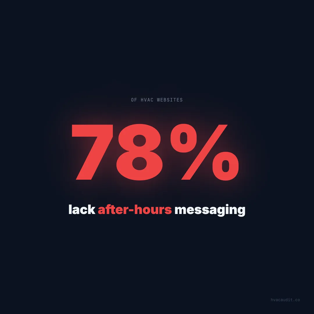
78% of HVAC websites lack after-hours messaging. The average site loads in 18.4 seconds. Here's how the industry handles — and mostly fails — the highest-value visitor: the emergency searcher.
It’s 11 PM on a January Saturday. The temperature outside is 18 degrees. A homeowner walks downstairs and realizes the furnace isn’t running. The house is already 58 degrees and dropping. She has elderly parents staying for the weekend. She grabs her phone, searches “emergency furnace repair near me,” and starts clicking.
78% of the HVAC websites she’ll visit have no after-hours messaging. No “24/7 emergency” badge. No after-hours phone number. No indication that a single human will respond before Monday morning.
The average site takes 18.4 seconds to load on mobile. She’s standing in a cold hallway, stressed, watching a loading bar crawl. 53% of mobile visitors leave after 3 seconds. She’s already hit the back button on 2 out of 3 sites before they finish loading.
When we audited 147 HVAC websites, we paid special attention to the emergency visitor experience. This is the highest-value visitor in HVAC — the homeowner who isn’t comparison shopping, isn’t price sensitive, and will pay premium rates for immediate help. And the industry is losing them at almost every touchpoint.
Emergency visitors are the most valuable — and most neglected
Not all website visitors are equal. The homeowner browsing on a Tuesday afternoon looking for a tune-up is worth $150–$200. The homeowner searching at 11 PM with no heat or no AC is worth $600–$1,200 in immediate revenue — and potentially $12,000+ in lifetime value.
Emergency visitors convert at 70–85% close rates compared to 35–45% for daytime routine inquiries. They don’t get three quotes. They don’t comparison shop. They call the first company that convincingly says “we’re available right now.”
Yet when we audited 147 sites through the lens of an emergency visitor, the results were dismal:
| Emergency UX element | % of sites that have it |
|---|---|
| ”24/7 Emergency” visible above the fold | 22% |
| After-hours phone number displayed | 18% |
| Emergency pricing shown | 8% |
| Response time promise | 11% |
| Live chat or chatbot after hours | 6% |
| Loads under 3 seconds on mobile | 14% |
| Sticky call button on mobile | 19% |
The average HVAC site has 0.9 of these 7 elements. Less than one. The emergency visitor lands on a site that loads slowly, shows no indication of after-hours availability, hides pricing, and makes the phone number hard to find on mobile.
She leaves. She finds the site that has these elements. She calls immediately.
What happens in the first 5 seconds of an emergency visit
When we looked at HVAC websites the way a homeowner would, we tracked the emergency visitor’s decision process second by second.
Second 0–1: The page starts loading. On 86% of sites, the homeowner sees a blank screen or a half-rendered layout. The header might load, but the hero image and body content are still loading.
Second 1–3: If the site hasn’t shown meaningful content, the emergency visitor is already considering the back button. 53% of mobile visitors leave at this point. The ones who stay are watching for one thing: any sign that this company can help right now.
Second 3–5: Content is now visible (on sites that load within 5 seconds — only 31% of sites audited). The emergency visitor scans for three keywords: “emergency,” “24/7,” or “available now.” If none of these appear above the fold, she assumes the company is closed.
Second 5–10: If trust signals are present, the visitor looks for the call button. On sites with a sticky tap-to-call button, she taps immediately. On sites where the phone number is in the footer or on a Contact page, she has to scroll or navigate — and 35% don’t bother.
The entire emergency conversion window is under 10 seconds. Any friction in that window — slow load, missing messaging, hidden phone number — kills the conversion. Not reduces it. Kills it. The emergency visitor doesn’t have patience. She has urgency.
The 18.4-second load time is an emergency conversion killer
Speed matters for every visitor. For emergency visitors, it’s the difference between capturing a $900 job and losing it to the competitor whose site loads in 2 seconds.
The average HVAC website loads in 18.4 seconds on mobile. When we tested emergency scenarios — simulating the homeowner searching on a phone at 11 PM — the load time problem was even worse. Many HVAC sites load large hero images, autoplay videos, and multiple third-party scripts that add 5–10 seconds of load time.
The emergency visitor has zero tolerance for slow loading. She’s stressed, she’s in a hurry, and she has 10 other results to try. At 3 seconds, 53% are gone. At 5 seconds, 70%. At 10 seconds, 85%. A site loading in 18.4 seconds is losing over 90% of its emergency traffic to load time alone.
Speed fixes for emergency conversion:
- Compress hero images to under 100KB (WebP format)
- Defer all third-party scripts (chat widgets, analytics, review plugins)
- Use a CDN for static assets
- Eliminate render-blocking CSS and JavaScript
- Set server response time under 200ms
These changes typically bring load times from 18 seconds to 2–3 seconds. The cost is minimal — a few hours of optimization work. The return is capturing emergency visitors who were previously bouncing before the page rendered.
After-hours messaging is the easiest fix with the biggest payoff
Of all the emergency UX elements, after-hours messaging has the highest ratio of impact to effort. Adding a “24/7 Emergency Service” badge to the header takes 5 minutes. The impact is immediate.
When we audited 147 sites, 78% had no after-hours messaging at all. The homeowner visiting at 10 PM saw the same site as the homeowner visiting at 10 AM — no indication of availability, no emergency language, no after-hours phone number.
The top-performing HVAC websites handle after-hours emergency visitors with four elements:
1. “24/7 Emergency Service” in the header. Not on an interior page. Not in the footer. In the header, visible on every page, without scrolling. This single element tells the emergency visitor: we’re open, we can help, keep going.
2. After-hours phone number or same number with instructions. “Call our 24/7 emergency line” removes the ambiguity. The visitor doesn’t have to wonder if calling at 11 PM will reach voicemail.
3. Emergency pricing displayed. “$200 emergency diagnostic, waived with repair” eliminates the pricing anxiety that prevents emergency calls. 92% of emergency callers say pricing transparency is the biggest factor in choosing which company to call. Without a price, she’s not calling — she’s scrolling to the site that shows one.
4. Response time promise. “A technician at your door within 90 minutes” gives the visitor a concrete expectation. It transforms the visit from “I hope someone answers” to “I’ll have heat back in 90 minutes.”
Site-by-site audit: 3 emergency UX profiles
To illustrate the gap, here are three real profiles from our audit — anonymized but representative of what we see repeatedly.
Site A: Score 24/100 — Emergency visitor experience
Load time: 22 seconds on mobile. The homeowner sees a blank screen for 6 seconds, then a stock photo hero loads. The phone number is in the footer — on mobile, it requires 4 full scrolls to reach.
After-hours messaging: None. The site mentions business hours on the Contact page: “Monday–Friday, 8 AM–5 PM.”
Emergency language: The word “emergency” appears once — on a Services page that requires two clicks to reach.
Click-to-call: The phone number is plain text, not tappable. On mobile, the visitor has to memorize or copy-paste the number.
Outcome: An emergency visitor at 11 PM lands on this site, waits 6 seconds for something to load, sees no mention of emergency service, can’t find a call button, and leaves. Total time on site: 8 seconds. Total conversions captured: zero.
Site B: Score 58/100 — Emergency visitor experience
Load time: 6 seconds on mobile. Content is visible by second 3, though images are still loading.
After-hours messaging: A small “Emergency Service Available” line in the footer.
Emergency language: The homepage hero says “AC & Heating Repair” but doesn’t mention emergency or 24/7 service.
Click-to-call: A phone number is in the header, and it’s tappable on mobile. But it’s styled in small text and easy to miss.
Outcome: The emergency visitor lands, sees content within 3 seconds, and scans for emergency signals. She doesn’t see “24/7” above the fold. She might scroll and find the footer mention, or she might leave. It’s a coin flip — and coin flips don’t build businesses.
Site C: Score 91/100 — Emergency visitor experience
Load time: 1.8 seconds on mobile. Full content renders in under 2 seconds.
After-hours messaging: “24/7 Emergency Service” badge in the header, red, visible on every page.
Emergency language: The hero text reads “Emergency AC & Heating Repair — Technician at Your Door in 90 Minutes.”
Click-to-call: A sticky green call button (48px, full-width) at the bottom of every mobile page. The header also has a tappable phone number.
Emergency pricing: “$200 emergency diagnostic — waived with same-night repair” visible below the hero.
Outcome: The emergency visitor lands in under 2 seconds, immediately sees “24/7 Emergency,” sees the price, sees the response time promise, and taps the call button. Total time from search to call: under 10 seconds. This site captures every emergency visitor who reaches it.
Site A and Site C serve the same market. They might be one mile apart. The difference between a 24-score site and a 91-score site isn’t the business quality — it’s the website’s ability to convert the most valuable visitor in HVAC.
The revenue gap between emergency-ready and emergency-blind sites
Let’s quantify what Site A is losing compared to Site C.
Assume both companies get 30 emergency-intent website visits per month (homeowners searching “emergency” + “24/7” + after-hours queries).
Site A (24/100):
- Emergency visitors who stay past load: 30% (9 visitors)
- Emergency visitors who find the phone number: 40% of remaining (3.6)
- Emergency visitors who call: 60% of remaining (2.2)
- At $900 average emergency ticket: $1,980/month
Site C (91/100):
- Emergency visitors who stay past load: 95% (28.5 visitors)
- Emergency visitors who see emergency messaging: 100% (28.5)
- Emergency visitors who call: 80% (22.8)
- At $900 average emergency ticket: $20,520/month
The gap: $18,540 per month — $222,480 per year — from the same 30 emergency visitors. Site A captures 2 calls. Site C captures 23 calls. Same traffic. Same market. Different website.
The 4 fixes that make a site emergency-ready
Every HVAC website can go from emergency-blind to emergency-ready in an afternoon. These aren’t redesign-level changes. They’re additions and adjustments to the existing site.
Fix 1: Add “24/7 Emergency Service” to the header
Place it in the top navigation bar or immediately below it. Use a contrasting color — red or bright green — so it stands out. Make it visible on every page, including mobile. This is a 5-minute CSS change that immediately signals availability to every after-hours visitor.
Fix 2: Add a sticky tap-to-call button on mobile
A fixed-position button at the bottom of the mobile viewport. Green background, white text, “Call Now” label, linked to your phone number with tel:. At least 48px tall. Visible on every page, stays put as the visitor scrolls. This single element accounts for the largest conversion lift in our data: 35–45% improvement on mobile.
Fix 3: Show emergency pricing above the fold
“$200 Emergency Diagnostic — Waived With Same-Night Repair” removes the biggest objection that stops emergency visitors from calling. 92% of emergency callers cite pricing uncertainty as the primary barrier. Show the price, remove the barrier, get the call.
The pricing doesn’t need to be exact. A range works: “Emergency repairs typically $300–$900, diagnostic fee waived with repair.” Any number is better than no number.
Fix 4: Compress images and defer scripts for sub-3-second load
The gap between 18.4 seconds and 2 seconds is almost always caused by the same things: uncompressed images, render-blocking scripts, and slow hosting. Compress images to WebP under 100KB, defer all non-critical JavaScript, and move to hosting with sub-200ms server response times.
These 4 fixes take 2–4 hours to implement and cost nothing beyond the time. They transform a site that loses 90% of emergency visitors into one that captures the majority of them.
Emergency UX is the highest-ROI investment in HVAC web design
Every other optimization on an HVAC website — SEO improvements, content marketing, review management, better forms — affects all visitors equally. Emergency UX fixes affect the highest-value visitors disproportionately.
The emergency visitor is worth 3x the daytime visitor in immediate revenue and potentially more in lifetime value. A site that converts 5 additional emergency visitors per month at $900 average ticket adds $4,500/month — $54,000/year — from changes that take an afternoon to implement.
When we audited 147 sites, the pattern was unmistakable. The sites scoring 80+ weren’t prettier. They weren’t more expensive. They simply answered the emergency visitor’s three questions within the first 5 seconds: Are you available now? How much will it cost? How do I reach you?
78% of HVAC websites fail to answer any of these questions. The average score is 34/100. The average load time is 18.4 seconds. The average emergency conversion rate is below 10%.
The contractors who fix these four elements don’t just improve their websites. They capture the most valuable segment of traffic in the industry — the segment their competitors are still sending to voicemail, to loading screens, and to the back button. Every night those competitors skip the fix is another night of $900 emergency calls going to the company that’s ready.
Keep reading
Want to know your score?
Drop your URL — full report in 48 hours.
We're on it.
Report in your inbox within 48 hours.