76% of HVAC Searchers Call in 24 Hours — If Mobile UX Lets Them
70% of HVAC inquiries come from mobile devices. If a homeowner can't tap-to-call within 3 seconds, you're losing the lead. Here's what mobile UX is costing you.
A homeowner’s AC dies at 3 PM on a Thursday in August. She’s standing in a 92-degree living room, two kids asking why it’s so hot, searching “AC repair near me” on her phone. She taps the first result. The site loads — slowly. She pinches and zooms to read tiny text. She scrolls past a stock photo hero, past a paragraph about “our commitment to excellence,” past a services dropdown, looking for a phone number. She can’t find one above the fold. She hits back and taps the second result.
70% of HVAC inquiries come from mobile devices. Not desktop. Not tablets. Phones held by stressed homeowners who need help now and will call the first company that makes it easy.
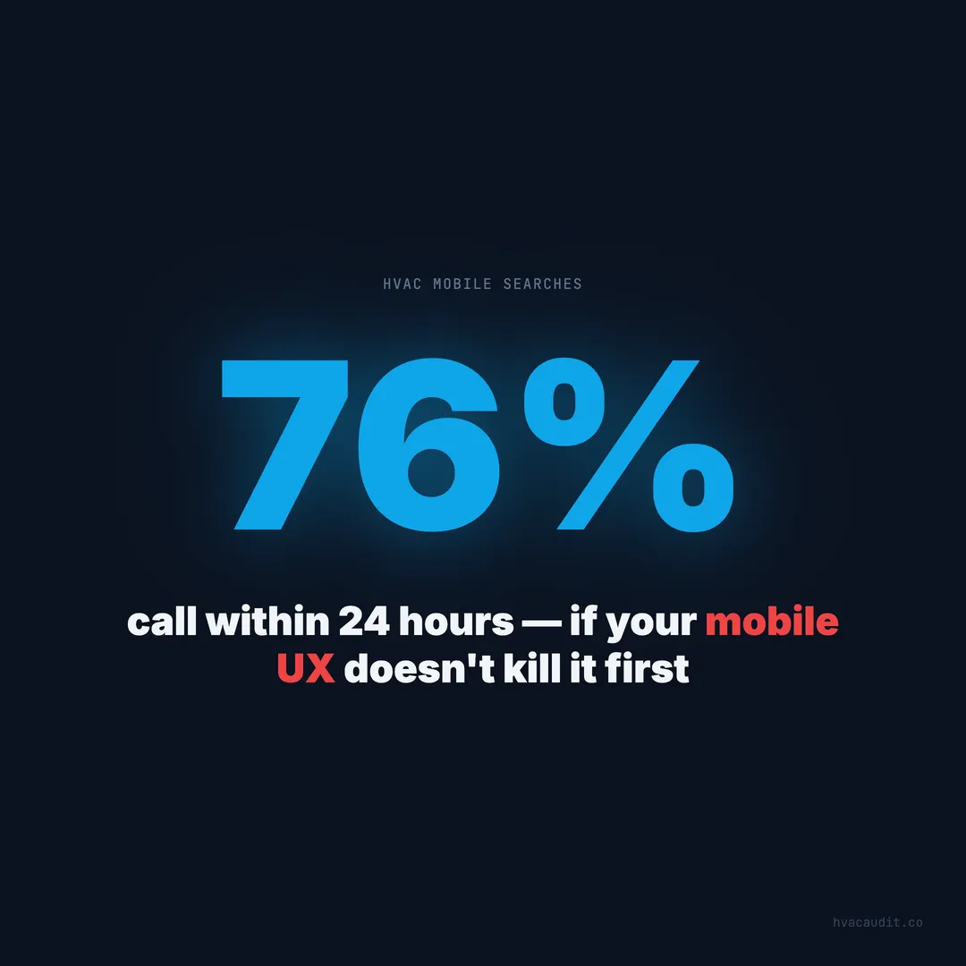
76% of people who search for a local service on their phone call a business within 24 hours. Many call within minutes. The window between search and decision is measured in seconds — and your mobile UX is either capturing that call or killing it.
Mobile isn’t a secondary experience — it’s the only one that matters
Most HVAC websites are built on desktop monitors. The designer views a 1440px-wide layout, positions elements carefully, and ships it. Then a CSS media query squishes everything into a 375px phone screen, and nobody checks what happens.
What happens is disaster.
82% of the HVAC sites we reviewed during our 147-site audit had significant mobile usability problems. Not minor layout shifts — fundamental UX failures that prevent conversions. Text too small to read. Buttons too small to tap. Navigation menus that cover the entire screen and can’t be closed. Forms that require horizontal scrolling.
When over 70% of your traffic arrives on mobile and your mobile experience is broken, you don’t have a website problem — you have a revenue problem.
The 3-second tap-to-call test
Here’s the test that matters: when a homeowner lands on your site on mobile, can she tap a button and call you within 3 seconds?
Not “find a phone number in text and manually dial it.” Not “scroll to the contact page.” Not “open a hamburger menu, find ‘Contact,’ navigate to a new page, then call.” One tap. Three seconds. Done.
Sites with a sticky tap-to-call button visible on every page convert 35–45% higher on mobile than sites without one. The button needs to be at least 48px tall, high contrast, and permanently visible — either in a sticky header or a fixed footer bar.
When we audited 147 sites, 81% had no persistent click-to-call on mobile. The phone number was either buried in the footer, listed only on the Contact page, or displayed as plain text that couldn’t be tapped. Every one of those sites was losing the highest-intent visitors — the ones ready to call right now.
What a broken mobile experience actually costs
Let’s run the numbers on a typical 3-truck HVAC company.
Monthly mobile visitors: 420 (70% of 600 total visitors) Current mobile conversion rate: 1.8% Leads from mobile: 7.6 per month Average ticket: $500
That’s $3,800/month from mobile — with an experience that’s actively fighting the visitor.
Now fix the mobile UX. Add a sticky tap-to-call. Compress images for fast mobile load. Make text readable without zooming. Simplify the form to 3 fields.
Improved mobile conversion rate: 5.5% Leads from mobile: 23.1 per month Revenue from mobile: $11,550/month
The difference: $7,750 per month — $93,000 per year — from fixing an experience that most contractors never even test on their own phone.
The 6 mobile UX killers we find on every audit
When we audit HVAC websites, the same mobile problems appear on nearly every site. These aren’t edge cases — they’re standard.
1. No sticky call button
The most critical element on a mobile HVAC site is a tap-to-call button that stays visible as the visitor scrolls. Without it, the homeowner has to remember your phone number, scroll back to the top, or navigate to another page. Each of those steps is a point where she gives up and calls someone else.
A sticky footer bar with a call button and a “Get Quote” button covers both conversion paths. It costs nothing to implement and it’s the single highest-ROI change you can make on mobile.
2. Slow mobile load time
The average HVAC site loads in 18.4 seconds. On mobile networks — especially 4G connections in suburban areas — it’s often worse. 53% of mobile visitors abandon a site that takes more than 3 seconds to load. At 18.4 seconds, you’re losing the vast majority before the page renders.
Mobile load optimization starts with images. A hero image at 3MB on desktop becomes a 20-second stall on a phone. Compress to WebP, serve responsive sizes, and lazy-load everything below the fold. These changes alone typically cut load time by 60–70%.
3. Unreadable text without zooming
The minimum readable font size on mobile is 16px. Below that, visitors pinch-to-zoom, which breaks the layout and makes navigation impossible. Yet 44% of the sites we audited used body text below 14px on mobile — forcing visitors to choose between reading and navigating.
Body text at 16–18px, headings at 24–32px, and adequate line spacing (1.5–1.6) make content scannable on any phone. The homeowner who can read your pricing without zooming is the one who calls.
4. Forms that don’t work on phones
A 7-field contact form on mobile is a conversion graveyard. Forms with more than 4 fields see 60%+ abandonment on mobile. The homeowner standing in a hot house doesn’t want to type her street address, select a service category from a dropdown, and choose a preferred appointment date.
Three fields. Name, phone, “How can we help?” That’s the form that converts on mobile. Everything else can be gathered during the call — when she’s already committed.
5. No emergency context above the fold
The homeowner searching at 11 PM with no AC doesn’t want to scroll through your company history. She wants three things: Can you come now? How much will it cost? How do I reach you?
78% of HVAC sites lack any after-hours messaging on mobile. No “24/7 Emergency” badge. No “Call Now — Technician Available Tonight.” The first screen of your mobile site should answer the emergency visitor’s questions in under 3 seconds — because that’s all the time you get.
6. Navigation that traps the visitor
Hamburger menus that expand to cover the entire screen and can’t be closed. Dropdown menus with 20 items that require precise finger taps. Mega-menus designed for desktop hover states that don’t translate to touch.
Poor mobile navigation causes 38% of visitors to leave without exploring beyond the first page. If the homeowner can’t easily find your services, your pricing, or your phone number from the navigation, the site has failed its primary job.
The mobile speed-to-lead connection
Mobile UX doesn’t exist in isolation. It’s the front door of a speed-to-lead pipeline that determines whether you capture the call or lose it.
Here’s the timeline:
Second 0: Homeowner searches “AC repair near me” on her phone. Second 1–3: She taps your search result. Your site starts loading. Second 3–5: If the site hasn’t loaded, she hits back. 53% are gone. Second 5–10: If loaded, she scans for trust signals: reviews, pricing, emergency badge. Second 10–15: If trust signals exist, she looks for the call button. Second 15–20: If the call button is visible and tappable, she calls.
Total time from search to call: 15–20 seconds. That’s the window. Every UX problem — slow load, hidden pricing, no call button, tiny text — extends that window. And every second of extension loses a percentage of visitors who were ready to call.
76% of local service searchers call within 24 hours. But “within 24 hours” doesn’t mean they’ll wait 24 hours for your site to work. It means they’ll call someone within 24 hours. The question is whether that someone is you or the competitor whose mobile site works.
What a high-converting mobile HVAC site looks like
The top 5% of HVAC websites share a mobile experience that’s nearly identical — because the formula is known. It’s not creative. It’s not innovative. It’s disciplined execution of basics.
First screen (above the fold, no scrolling):
- Company name and logo (small, top-left)
- “24/7 Emergency AC & Heating” in clear text
- “$150 Diagnostic — Waived With Repair”
- Tap-to-call button: green, 48px+, full-width or near full-width
- “4.8 stars (312 reviews)” — visible, not hidden in a menu
Sticky footer bar (visible on every page):
- Call button (left half)
- “Get Free Quote” button (right half)
- Always visible, never hidden by content
Service pages on mobile:
- Service name as H1 (“AC Repair” not “Services”)
- Price range in first paragraph
- Response time (“Same-day service available”)
- 2–3 embedded reviews
- Call button after every section
Load time: Under 2.5 seconds on 4G.
This isn’t a $20,000 mobile redesign. It’s a $500 afternoon of fixes applied to an existing site. The homeowner doesn’t care about animations, parallax scrolling, or video backgrounds. She cares about three things: can you fix it, what does it cost, and how do I call you.
Testing your own mobile experience takes 2 minutes
Pull out your phone. Open your website. Set a timer.
Can you find the phone number and tap to call within 3 seconds? If not, you’re losing the majority of mobile visitors who are ready to call.
Does the page fully load within 3 seconds? Open an incognito tab to eliminate caching. If it takes more than 3 seconds, you’re losing 53% of visitors before they see your content.
Can you read the body text without zooming? If you have to pinch-zoom, your text is too small. Every homeowner who visits your site is making the same pinch — and most won’t bother.
Can you fill out the contact form with one thumb? Try it. If the form requires a keyboard switch, precise tapping, or horizontal scrolling, it’s costing you submissions.
Is there a “24/7 Emergency” indicator visible without scrolling? If not, every after-hours visitor assumes you’re closed.
Two minutes. Five questions. If your site fails any of them, you’re losing mobile leads — which means you’re losing 70% of your total leads — to a problem that costs less to fix than a single service call.
The competitors who fix mobile first win everything
Mobile UX is the single highest-leverage fix for any HVAC website. It affects the largest portion of traffic (70%+), it has the most direct path to conversion (search to call in seconds), and it’s the cheapest to improve (compress images, add a sticky call button, increase font size).
The HVAC company that fixes mobile UX first in a local market captures a disproportionate share of leads — because their competitors haven’t done it yet. When the average site scores 34/100 and loads in 18.4 seconds, a site that loads in 2 seconds with a sticky call button doesn’t just perform better. It dominates.
76% of searchers call within 24 hours. Your mobile UX determines whether that call goes to you or to the competitor whose site actually works on a phone. Every day your mobile experience stays broken is another day of lost conversions you’ll never recover.
Mobile UX is one of the hidden gaps that kills conversion on good-looking sites. See the full diagnostic for HVAC websites that look great but don’t convert.
Keep reading
Want to know your score?
Drop your URL — full report in 48 hours.
We're on it.
Report in your inbox within 48 hours.