Your HVAC Website's Homepage Is Backwards — Here's How to Fix It
Most HVAC homepages lead with company history and certifications. Top converters lead with the customer's problem. Here's the exact structure that converts 3x more visitors.
Open your HVAC website’s homepage. Read the first thing a visitor sees. Is it about your company or about the customer’s problem?
If it says “Welcome to [Company Name]. Family-owned since 1987. Providing quality HVAC services to the greater [city] area” — your homepage is backwards. You’re leading with what matters to you instead of what matters to the person about to spend $300–$15,000 on HVAC service.
The HVAC sites in the top 5% of our audit scores all share one trait: the homepage leads with the customer’s problem, not the company’s story. This single structural change can double or triple your conversion rate.
The backwards homepage structure
Here’s what 70% of HVAC homepages look like:
- Hero section: Company name, logo, tagline (“Your Comfort Is Our Priority”), stock photo of a technician smiling
- About section: Company history, how long you’ve been in business, family-owned narrative
- Services grid: Six icons — AC, Heating, Duct Work, IAQ, Maintenance, Installation — each linking to a separate page
- Certifications: NATE certified, BBB accredited, EPA licensed, manufacturer logos
- Contact section: Form buried at the bottom after 4 sections of scrolling
This structure makes sense to the business owner. It’s how you’d introduce yourself in person — name, history, what you do, credentials, then “call me.” It’s a resume. And nobody hires an HVAC contractor by reading their resume.
What the customer actually wants
The homeowner searching “AC repair near me” has one question: Can you fix my AC, and can you do it today?
They don’t want your company history. They don’t care that you’ve been in business since 1987 until after they’ve decided you can solve their problem. They don’t need to see six service icons — they need one service, right now.
Here’s what they want in order:
- Confirmation you do what they need. “AC Repair — Same-Day Service.” Three seconds to confirm they’re in the right place.
- Proof you’re trustworthy. Reviews, license number, years in business. Not as the main event — as supporting evidence.
- A way to take action. Phone number, booking button, or form. Visible without scrolling.
- Details if they need them. Pricing, service details, process — for the 30% who want to research before calling.
Everything else — company history, team photos, blog posts, community involvement — is nice to have. It’s not what converts visitors into callers.
The flipped homepage structure
Here’s the structure that converts:
Section 1: Problem + Solution + CTA (above the fold)
“AC Not Working? We’ll Be There in 60 Minutes.”
- Tap-to-call button
- “Book Online” button
- Trust bar: “4.9 stars · 200+ reviews · Licensed & Insured · $89 diagnostic”
This section does 80% of the conversion work. It confirms the service, builds trust, and provides a clear action — all without scrolling.
Section 2: Social proof (reviews)
Three to five of your best Google reviews. Real names, star ratings, and the review text. This is the single most persuasive element on your site — 93% of homeowners check reviews before calling.
Don’t link out to Google. Embed the reviews directly on the page. The visitor who clicks away to read reviews on Google may not come back.
Section 3: How it works (3 steps)
- Call or book online
- We diagnose the problem (same day)
- You approve the fix — flat-rate pricing, no surprises
This removes uncertainty. The homeowner knows what to expect. Three steps, no jargon, no “contact us for a consultation.”
Section 4: Services (what you do)
Now the service grid makes sense — the visitor has already seen your value proposition and social proof. Here you expand: AC repair, heating repair, installation, maintenance plans, duct work. Each links to a dedicated service page.
Section 5: Why us (credentials + story)
Now — after they’re already considering calling — you share your credentials. NATE certified, 30 years experience, family-owned, community involvement. This is where the company story earns its place: as reinforcement, not introduction.
Section 6: Service area + CTA
“Serving [City] and surrounding areas. Need HVAC service today?”
- Phone number
- Booking widget or contact form
Every page should end with a CTA. The visitor who scrolled this far is interested — give them an easy way to convert without scrolling back up.
Why this works
The flipped structure matches the customer’s decision-making process:
- Can you help me? (Problem + Solution)
- Can I trust you? (Reviews)
- What will the process be like? (How it works)
- Do you do the specific thing I need? (Services)
- Are you legitimate? (Credentials)
- How do I start? (CTA)
The backwards structure puts step 5 first and step 1 last. It’s the equivalent of walking into a store and hearing a 5-minute company history before anyone asks what you need.
The conversion impact
When we see HVAC websites flip their homepage structure, the results are consistent:
Bounce rate drops 20–35%. Visitors immediately see that the site is relevant to their search. There’s no confusion about whether this company does what they need.
Time to first CTA drops from 15+ seconds of scrolling to zero. The phone number or booking button is visible instantly. The friction between “I need this” and “I can do this” disappears.
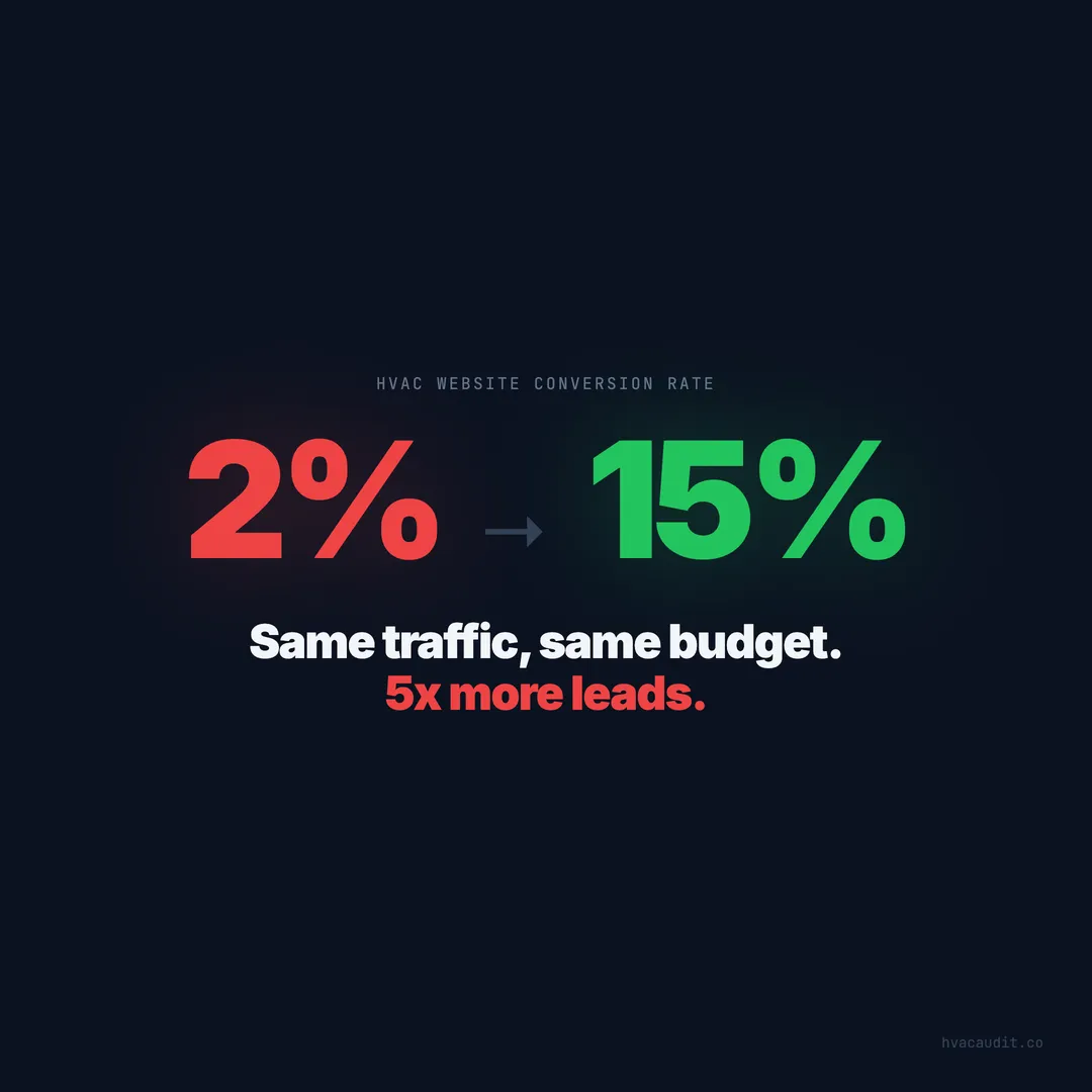
Conversion rate typically doubles from 2–3% to 5–8%. On a site getting 500 visitors per month, that’s 15 extra leads per month from the same traffic. At a $500 average service call, that’s $7,500/month in additional revenue.
And this change doesn’t require a redesign. You’re rearranging existing content. The company history section doesn’t get deleted — it moves down. The reviews don’t get added from scratch — they get moved from a separate reviews page to the homepage. The CTA gets bigger and moves up.
How to flip your homepage this week
Step 1: Rewrite your hero section (2 hours). Replace “Welcome to [Company]” with “[Service] — [Speed] — [Price/Trust signal].” Add a tap-to-call button and a booking link. Remove the stock photo and use a solid background or a small, compressed photo of your actual team.
Step 2: Move reviews to the homepage (1 hour). Embed 3–5 Google reviews right below the hero. Use a widget that pulls from Google automatically, or manually copy your best reviews with star ratings.
Step 3: Add a “How it works” section (1 hour). Three steps. Simple. This takes visitors from “interested” to “ready to call” by removing process uncertainty.
Step 4: Push company info below the fold (30 minutes). Don’t delete it. Move it to section 5 or 6. Let it do its job as reinforcement instead of introduction.
Step 5: Add a CTA at the bottom (30 minutes). Repeat the phone number and booking button. Visitors who scroll to the bottom are interested — make it easy for them to take action.
Total time: half a day. No developer needed for most website platforms. The impact on conversions is measurable within 2 weeks.
The real-world objection: “But our company story is important”
It is. Nobody’s saying delete it. The company story — your 30 years in business, your family heritage, your commitment to the community — builds trust. It matters. But it matters at the right moment in the customer’s journey.
Think of it like a sales call. When a homeowner calls and says “my AC died,” you don’t start with “Well, let me tell you about our company’s founding in 1987.” You say “I can have a tech there in an hour. It’s a $89 diagnostic. What’s your address?” You answer their question first. The company story comes later, naturally, when they ask “how long have you been doing this?”
Your homepage should work the same way. Lead with the answer to their question. Let the story do its work further down the page — where the visitor who’s already interested scrolls to learn more about who they’re hiring.
The data supports this consistently: the top 5% of HVAC websites lead with service, speed, and pricing. The bottom 50% lead with company history. The conversion rate gap is 5–10x. Same story, different position on the page, completely different results.
Keep reading
Want to know your score?
Drop your URL — full report in 48 hours.
We're on it.
Report in your inbox within 48 hours.